UX Risk Analysis for Digital Health: A Practical Guide

Martin Sandhu
Martin Sandhu

July 2025

Why is UX risk analysis critical in digital health?

In digital health, a confusing interface isn’t just an annoyance—it can affect diagnosis, dosing, triage decisions, or whether a patient seeks care at all. That makes UX a safety issue, not just a polish layer.

A UX risk analysis looks at your product through a safety lens: if users misunderstand, mis-tap, or skip steps, what could happen? For regulated products, this analysis is essential input into your overall risk management. For non-regulated products, it’s still a competitive advantage—safer, clearer products win trust.

How do you define the context for a UX risk analysis?

Start with three anchoring questions:

  1. Who are the users?
    Clinicians, patients, caregivers, administrators? What’s their level of training, stress, and digital comfort?
  2. What are they trying to accomplish?
    Prescribe, self-manage, triage, review results, act on insights?
  3. Where and how are they using it?
    Busy ward, GP practice, home, mobile on the go?

Write this down. These contextual details determine what counts as a plausible use error—someone using a phone one-handed in bright sunlight has different risks than a nurse using a desktop in a dim ICU room.

How do you identify potential use errors?

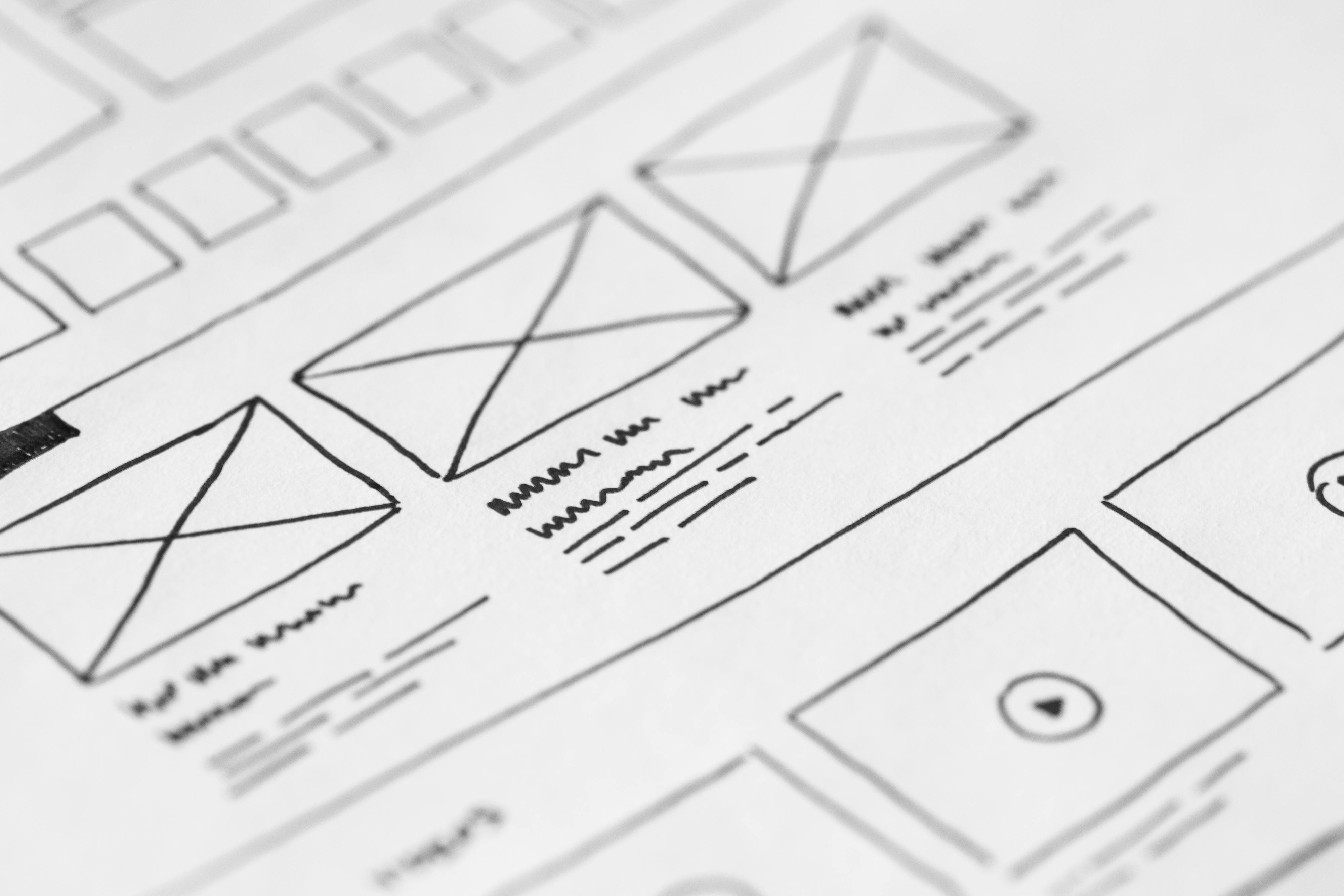
The most practical approach is a task analysis:

  • Map the key workflows: login, onboarding, entering data, reviewing results, acting on insights.
  • Break each workflow into small steps (click, select, interpret, confirm).
  • For each step, ask “What could go wrong?”

Typical categories of use errors include:

  • Misinterpretation (e.g., misreading units or trends)
  • Omission (skipping a necessary step)
  • Commission (doing something that shouldn’t be done)
  • Confusion between similar options
  • Input errors (wrong patient, wrong value, wrong time)

You can run this as a structured workshop with product, UX, clinical, and QA. If you have any formative usability testing data already, mine it for near-misses and confusion—it’s a goldmine of real use risks.

How do you assess severity and prioritize risks?

Not all usability issues are created equal. A small annoyance (e.g. extra scrolling) isn’t the same as a mis-dosed medication.

For each potential use error:

  • Describe the consequence – what happens if this error occurs and goes undetected?
  • Estimate severity – from negligible (slight inconvenience) up to serious injury.
  • Consider likelihood – based on how easy it is to make that mistake, plus any early usability observations.

You don’t need perfect numbers; a simple qualitative scale (low / medium / high) is enough to prioritize. Focus first on high-severity scenarios—even if you believe they are unlikely. Safety-first.

How do you design mitigations into UX rather than into training?

Once you’ve prioritized, brainstorm ways the design can prevent or reduce risk. For example:

  • Prevent entry errors
    Use safe defaults, input masks, constraints, and inline validation to make incorrect entries harder.
  • Make states obvious
    Clear labeling of patient context, mode (test vs live), and status reduces wrong-patient or wrong-mode mistakes.
  • Clarify hierarchy and meaning
    Use visual hierarchy to emphasize the most critical information; avoid ambiguous icons or colors.
  • Add smart confirmations—where they add safety, not noise
    Confirmations before irreversible, high-impact actions (e.g., deleting data, finalizing orders) with clear, concise language.
  • Handle edge cases gracefully
    If data is missing, delayed, or ambiguous, say so instead of silently failing. Ambiguity breeds risky assumptions.

The goal is to rely less on training and memory, and more on interfaces that make the right action the easiest and most obvious one.

How do you validate that risks have actually been reduced?

After implementing mitigations, test the product with representative users in realistic scenarios, paying particular attention to high-risk tasks.

In those sessions:

  • Observe whether previously identified use errors still occur.
  • Capture near-misses and workarounds.
  • Ask users to “think aloud” as they make decisions.

Update your risk analysis with findings: some risks may move from high to low; new ones may appear. This is normal—it’s an iterative process.

Over time, you build:

  • A clearer understanding of how your product is actually used
  • Evidence that you took reasonable steps to mitigate risk
  • A richer design rationale that supports both safety and usability

UX risk analysis isn’t about making your product risk-free—that’s impossible. It’s about making risks visible and systematically designing them down.

Like this?

More

HealthTech

insights

View more insights

Contact us

Let’s talk

We create human-centered solutions that drive positive outcomes for users and organisations. Let’s collaborate.

See our work
nuom
Typically replies in a few hours
nuom
Hi there!
How can we help you today?
Start Whatsapp Chat
WhatsApp icon